
Mountain Ridge Flyer
Mountain Ridge Flyer
Project Overview
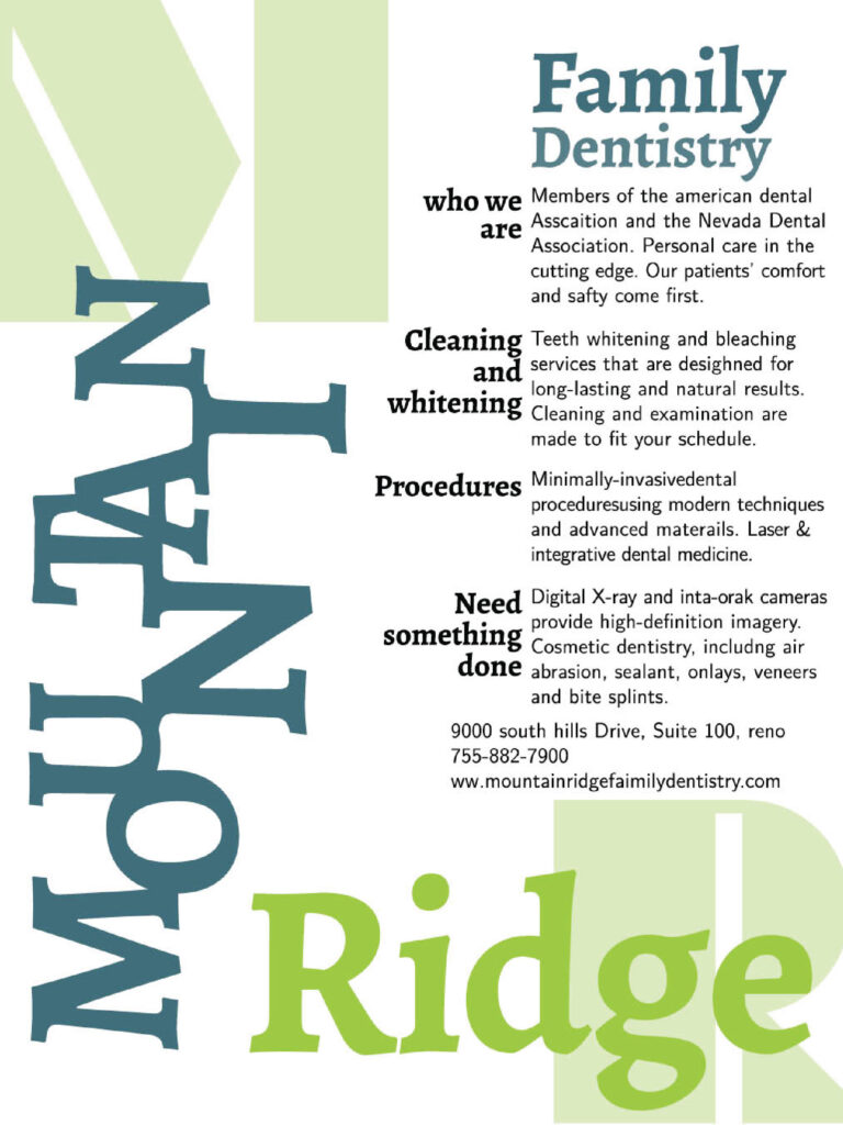
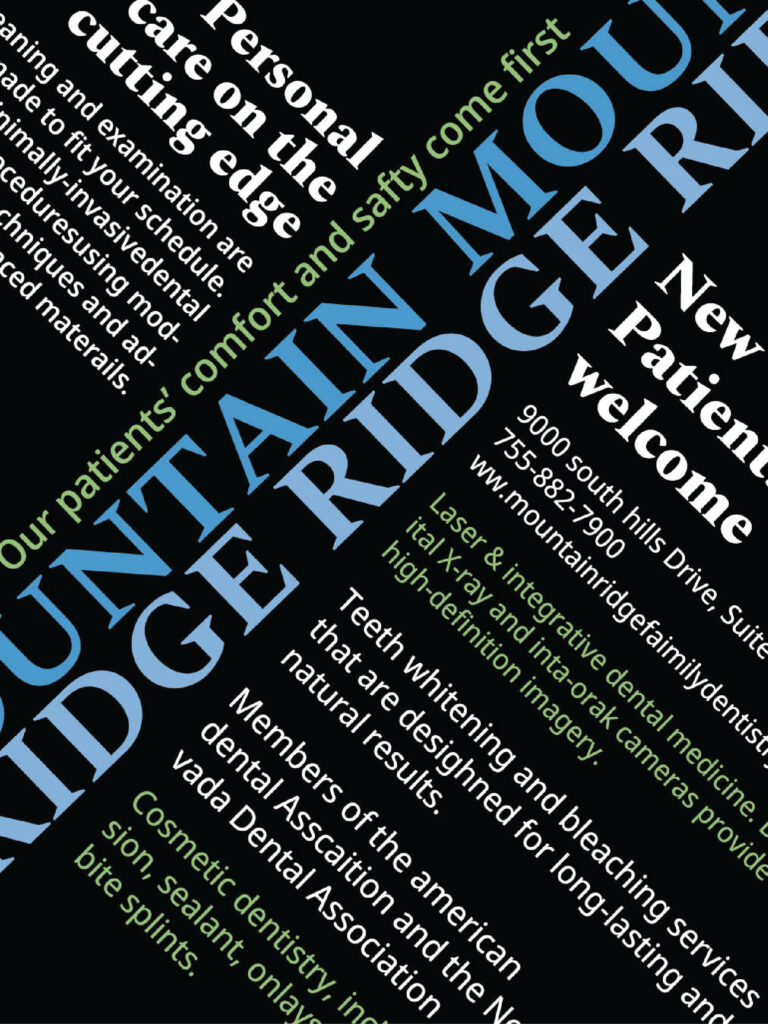
This project involved creating two typographic flyers for Mountain Ridge Family Dentistry, using only type as the main design element to communicate information clearly and creatively. The assignment required two different approaches: one flyer where typography could overlap and interact, and another where all text had to remain separate without touching. To keep both designs connected as part of the same project, I maintained a consistent visual theme through color while varying the exact palette so each flyer still had its own identity.
For the overlapping version, I wanted the layout to feel energetic while remaining readable, so I created a watermark effect in the corners using the initials “MR” for Mountain Ridge. I arranged the text so that it moved up and down the page, creating visual rhythm and allowing the overlapping elements to feel intentional rather than crowded. For the second flyer, where no typography could touch, I relied on a more structured grid system to organize the information. This allowed the layout to stay clear and easy to follow while still feeling visually interesting and engaging. Through this project, I learned how strongly typography alone can shape the mood of a design and how layout decisions can create both clarity and personality without relying on imagery.