
Roboto vs. Oswald
Roboto vs Oswald Poster
Project Overview
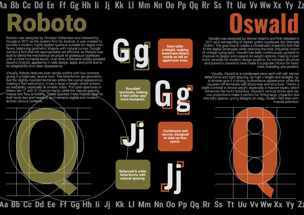
This project focused on creating a comparison poster between two typefaces of the same general category, with the goal of analyzing their visual similarities and structural differences. I chose two sans serif typefaces, Oswald and Roboto, because while they appear similar at first glance, they contain important distinctions in proportion, weight, and letter construction. The poster required a close study of each typeface, including displaying both full alphabets and examining specific details such as rounded versus sharper edges, stroke variation, and the way certain letterforms are shaped. I wanted the layout to clearly present both fonts while also guiding the viewer through the comparison in a visually organized way, so I focused on balancing structure with readability. Through this assignment, I learned a great deal about typographic anatomy and how subtle design differences can affect where and how a typeface works best. It also strengthened my understanding of type selection and why certain fonts are more effective than others depending on the design context.