
Warnock Booklet
Warnock Booklet
Project Overview
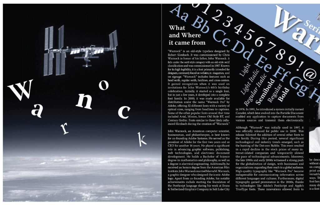
This project focused on designing a booklet centered around Warnock, a typeface I chose because I found it visually interesting and distinctive compared to the other options provided. The goal of the assignment was to present the typeface through its alphabet, different weights, and size variations while also incorporating a historical event from within ten years of the font’s creation and three images into the layout. One of the biggest challenges was fitting all of these required elements into a limited amount of space while still keeping the booklet visually engaging and easy to read. To address this, I developed a layout that used angles and square forms to create movement and variety across the pages, helping guide the viewer through the content without making it feel crowded. My goal was to balance structure with creativity so the booklet felt informative but still visually dynamic. Through this project, I learned how important hierarchy, spacing, and layout are in editorial design, and I feel the final result successfully presents the typeface in a way that is both clear and visually interesting.